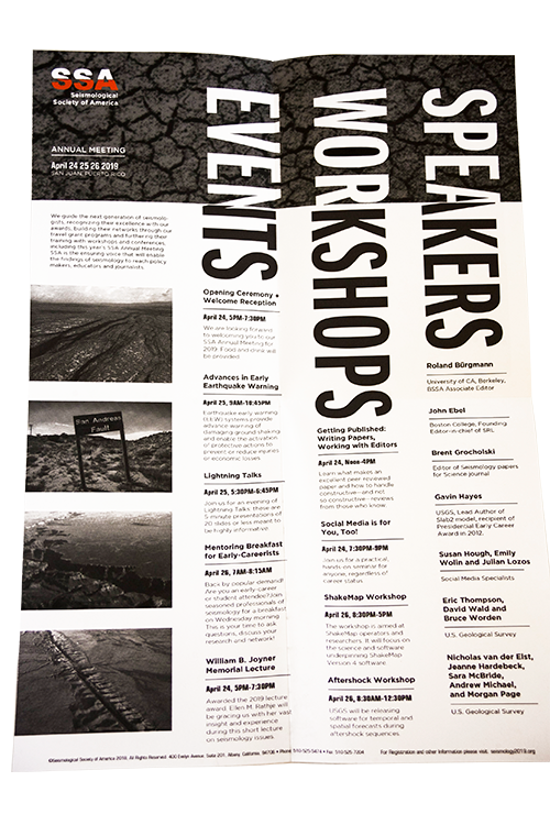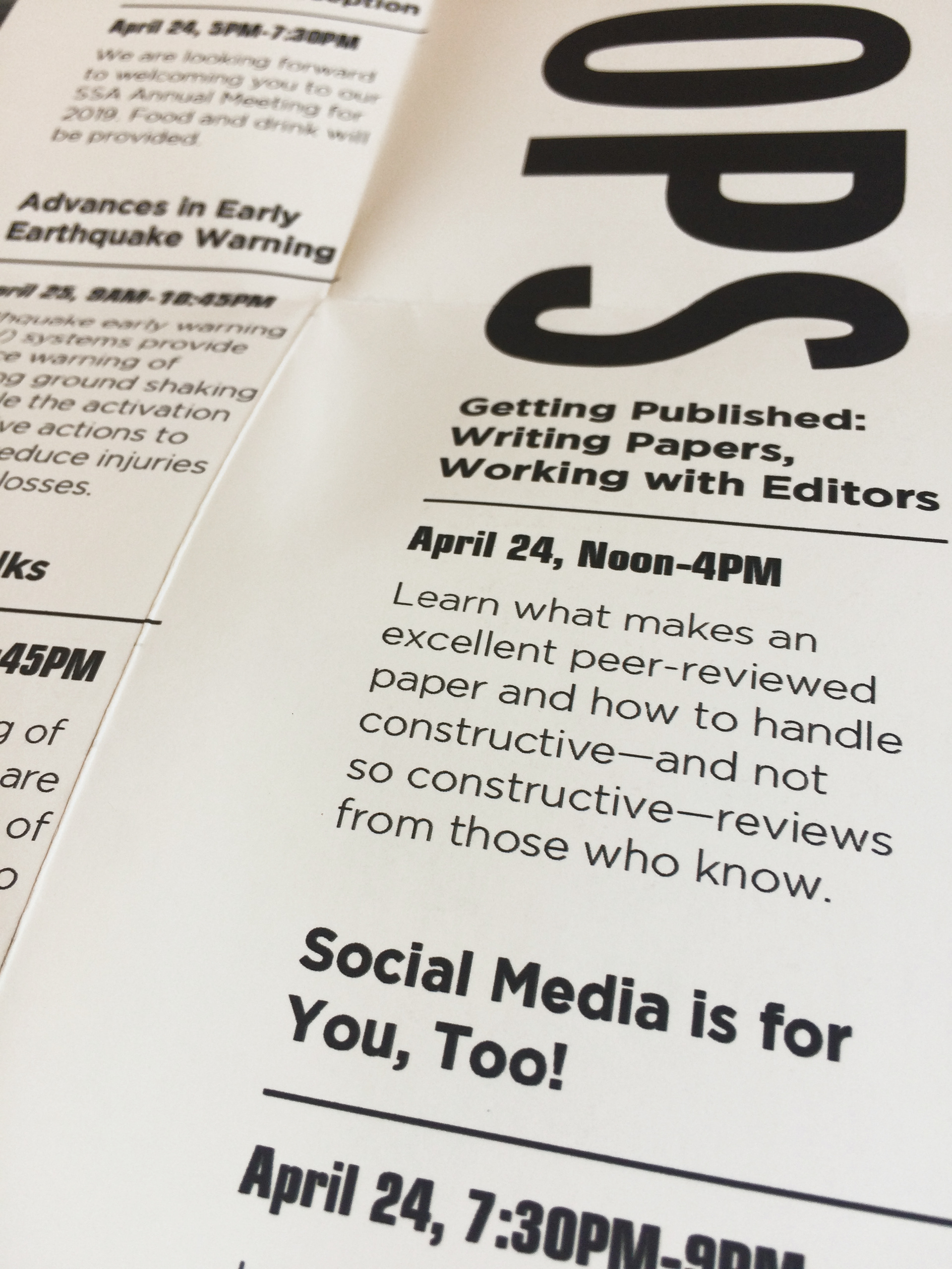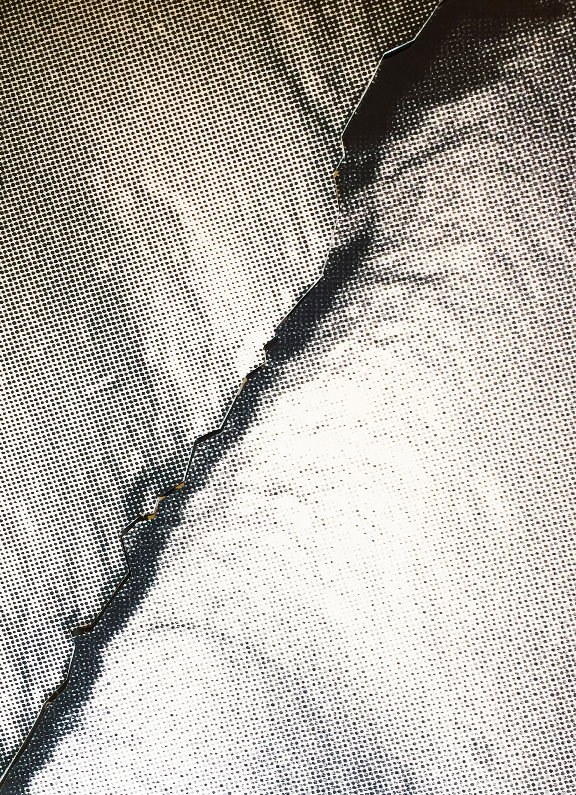


I was asked to rebuild the brand identity for the Seismological Society of America, and their 2019 Annual Meeting. How can one design content around the subject of earthquakes, and make it more shocking than it already is.The main objective was to establish a more consistent identity, and to arrest the attention of SSA's audience and meeting attendees. This was accomplished through the creation of a new logo, color palette, and brand imagery; as well as a series of deliverables to be used leading up to and during the SSA Annual Meeting.